
What is a Scatter Plot?
A scatter plot is a diagram to present the relationship between two variables of a data set. A scatter plot consists of a set of data points. On the scatter plot, a single observation is presented by a data point with its horizontal position equal to the value of one variable and its vertical position equal to the value of the other variable. A scatter plot helps us to understand:
- Whether the two variables are related to each other or not
- What the strength of their relationship
- The shape of their relationship
- The direction of their relationship
- Whether outliers are present
How to Use Minitab to Generate a Scatterplot
Data File: “Scatter Plot” tab in “Sample Data.xlsx”
Steps to render a Scatterplot in Minitab:
- Click Graph → Scatterplot.
- A new window named “Scatterplots” pops up.
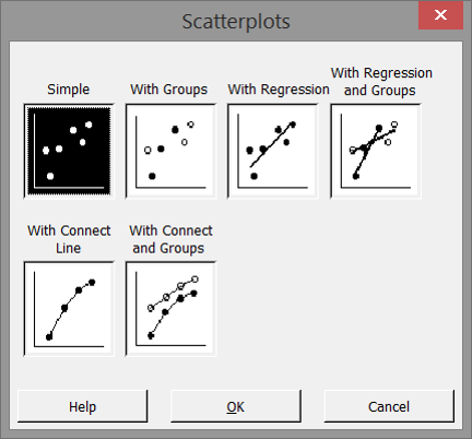
- Leaving “Simple” selected, click “OK”
A new window “Scatterplot– Simple” pops up. - Select “MPG” as the “Y variables.”
- Select “weight” as the “X variables.”
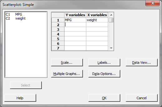
- Click “OK.”
- The scatter plot appears in the new window.
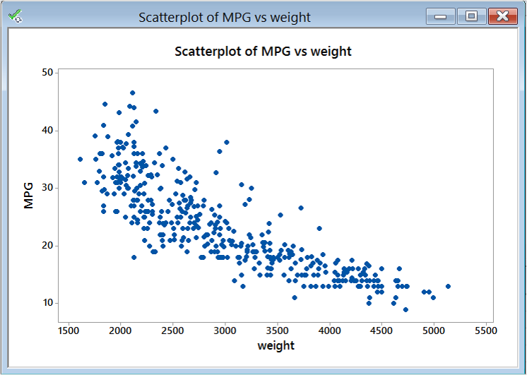
Model summary: The figure above is Minitab’s output of the scatterplot data. You can immediately see the value of graphical displays of data. This information obtainable by viewing this output shows a relationship between weight and MPG. This scatterplot shows that the heavier the weight the lower the MPG value and vice versa.
Comments are closed.