
Why we use a Run Chart
A run chart is a chart used to present data in time order. These charts capture process performance over time. The X axis indicates time and the Y axis shows the observed values. A run chart is similar to a scatter plot in that it shows the relationship between X and Y. Run charts differ however, because they show how the Y variable changes with an X variable of time.
Run charts look similar to control charts except that run charts do not have control limits and they are much easier to produce than a control chart. A run chart is often used to identify anomalies in the data and discover pattern over time. They help to identify trends, cycles, seasonality and other anomalies.
How to Plot a Run Chart in SigmaXL
Data File: “Run Chart” tab in “Sample Data.xlsx”
- Select the entire range of the data (“Measurement”, “Cycle” and “Trend”).
- Click SigmaXL -> Graphical Tools -> Run Chart
A new window named “Run Chart” pops up with the selected range of data appearing in the box under “Please select your data”
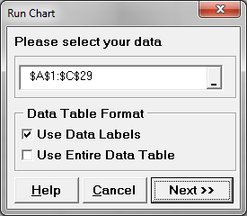
- Click “Next>>”
- A new window also named “Run Chart” appears
- Select “Measurement” as the “Numeric Data Variable (Y)”
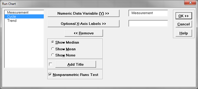
- Click “OK”
- The run chart appears automatically in the tab “Run Chart (1)”

The figure above is a run chart created with SigmaXL. The time series displayed by this chart appears stable. There are no extreme outliers, no visible trending or seasonal patterns. The data points seem to vary randomly over time.
Now, let us look at another example which may give us a different perspective. We will create another run chart using the data listed in the column labeled “Cycle”. This column is in the same file used to generate the figure above. Follow the steps used for the first run chart and instead of using “Measurement” use “Cycle” in the Run Chart dialog box pictured in the figure below.
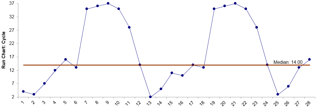 In the figure above, the data points are clearly exhibiting a pattern. It could be seasonal or it could be something cyclical. Imagine that the data points are taken monthly and this is a process performing over a period of 2.5 years. Perhaps the data points represent the number of customers buying new homes. The home buying market tends to peak in the summer months and dies down in the winter.
Using the same data tab lets create a final run chart. This time use the “Trend” data. Again, follow the steps outlined previously to generate a run chart.
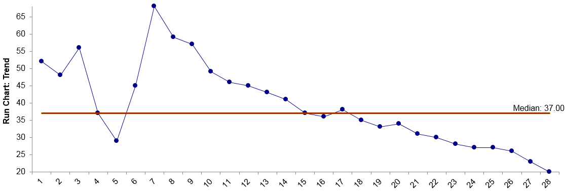 In this example, the process starts out randomly, but after the seventh data point almost every data point has a lower value than the one before it. This clearly illustrates a downward trend. What might this represent? Perhaps a process winding down? Product sales at the end of a product’s life cycle? Defects decreasing after introducing a process improvement?
Model summary: It should be clearly evident through our review of Histograms, Scatterplots and Run Charts, that there is great value in “visualizing” the data. Graphical displays of data can be very telling and offer excellent information.
Comments are closed.