
What is a Histogram?
A histogram is a graphical tool to present the distribution of the data. These plots are used to better understand how values occur in a given set of data. The X axis represents the possible values of the variable and the Y axis represents the frequency of the value occurring. This graphical tool consists of adjacent rectangles erected over intervals with heights equal to the frequency density of the interval. The total area of all the rectangles in a histogram is the number of data values.
A histogram can also be normalized. In the case of normalization, the X axis still represents the possible values of the variable, but the Y axis represents the percentage of observations that fall into each interval on the X axis. The total area of all the rectangles in a normalized histogram is 1. When using this type of graph, we have a better understanding of the shape, location, and spread of the data.
How to Use SigmaXL to Generate a Histogram,
Data File: “Histogram” tab in “Sample Data.xlsx”
Steps to render a histogram in SigmaXL:
- Select the entire range of data
- Click SigmaXL -> Graphical Tools -> Histograms & Descriptive Statistics
- A new window named “Histograms & Descriptive” pops up with the selected range appearing in the box under “Please select your data”
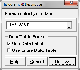
- Click “Next>>”
- A new window named “Histograms & Descriptive Statistics” appears
- Select “HtBk” as the “Numeric Data Variables (Y)”
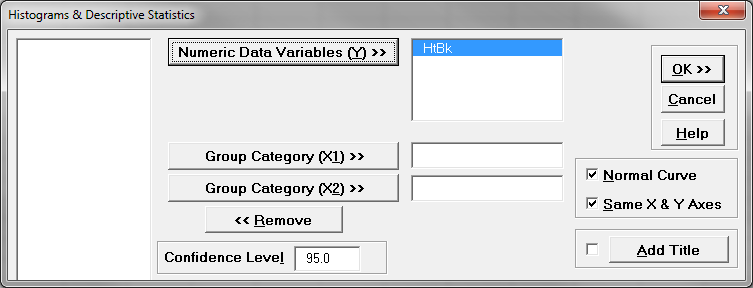
- Click “OK”
- The normality test results appear in the newly generated tab “Hist Descript (1)”
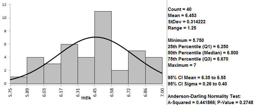
Model summary: The output from the previous steps has generated a graphical summary report of the data set HtBk. Among the information provided is a histogram. The image shows the frequency of the data for the numerical categories ranging from 5.7 to 7. You can see the shape of the data roughly follows the bell curve.
Comments are closed.